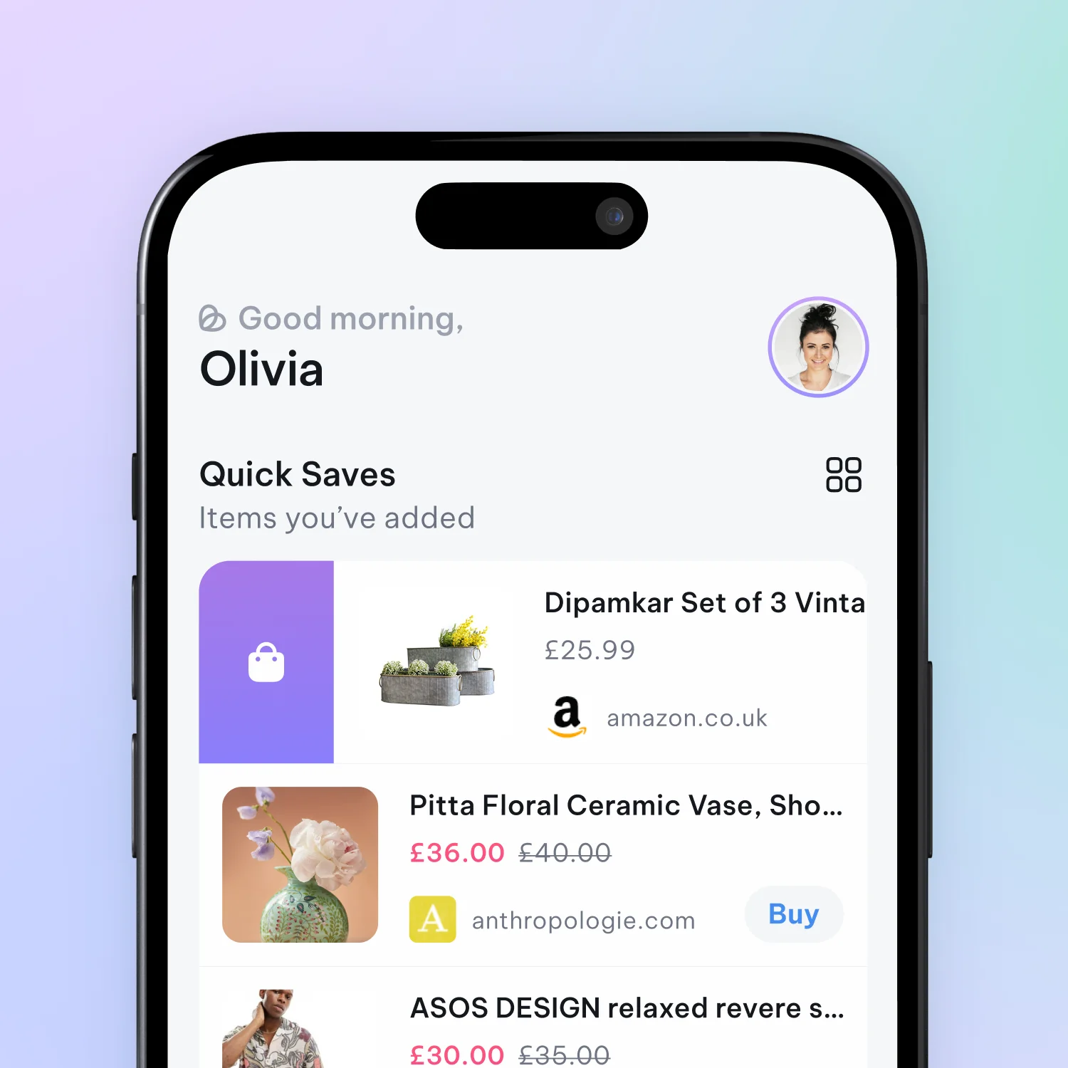
List Vs Grid View


Basket has been built to offer a familiar online e-commerce look and feel while also catering to the needs of an app that helps people stay organised. There are two main view modes when looking at products, either in quick saves or within baskets.
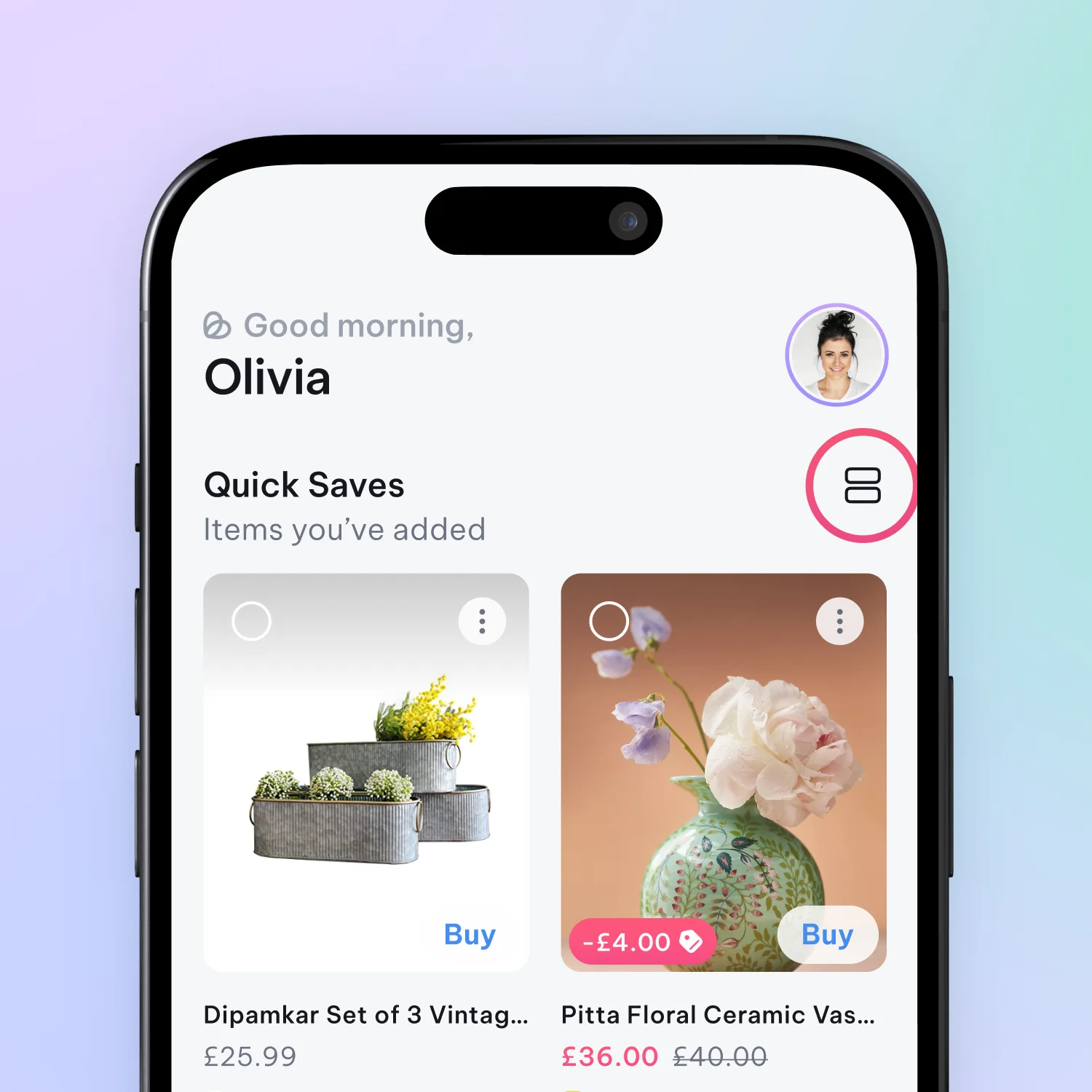
You can toggle between these view modes by tapping this icon at the top of Quick Saves:
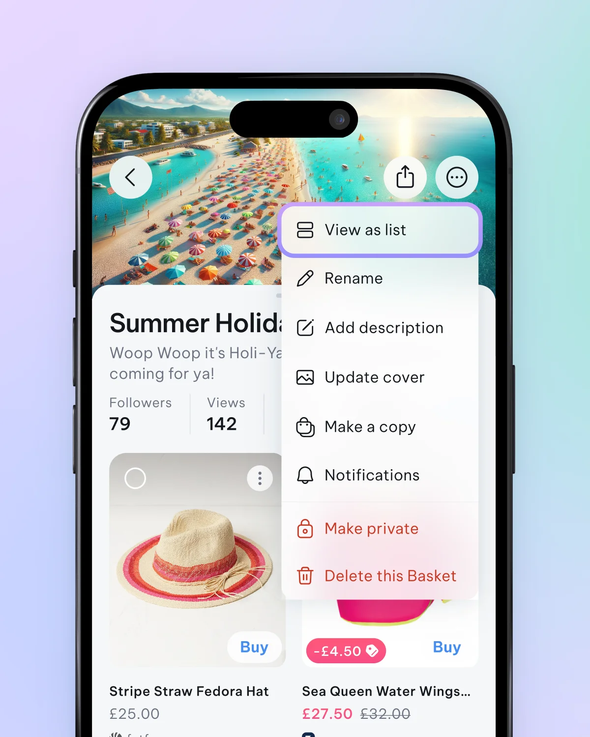
Or by tapping the three dots to open the additional options menu inside a basket.
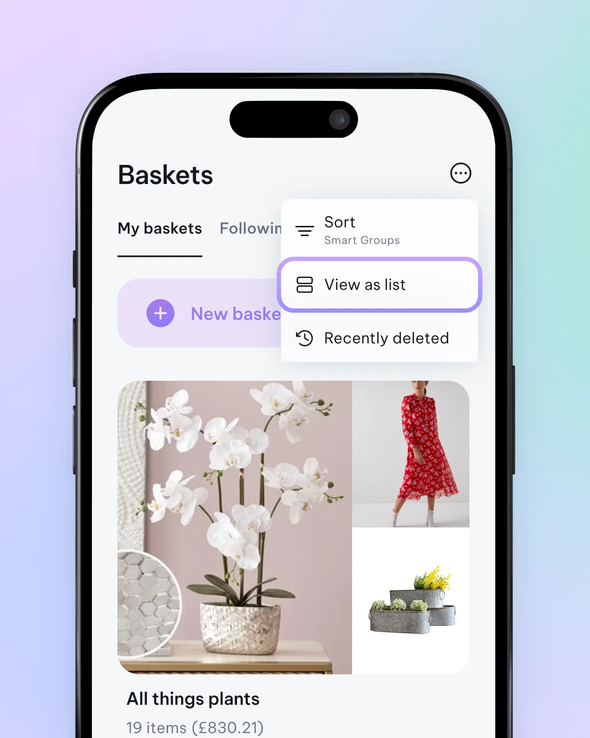
Tip: You can also toggle between view modes of baskets you've created. There’s an image-heavy grid view and a more compact list view. Toggle between these views by tapping the three dots at the top of the main ‘Baskets’ screen.
Grid View
One of the best features of grid view is that if there are multiple images for any item, you can swipe through them while still in the grid view. By tapping and holding while in grid view, you'll bring up a menu that allows you to move, delete, and mark items as purchased. This view mode suits fashion, furniture, and products where aesthetic quality is essential.
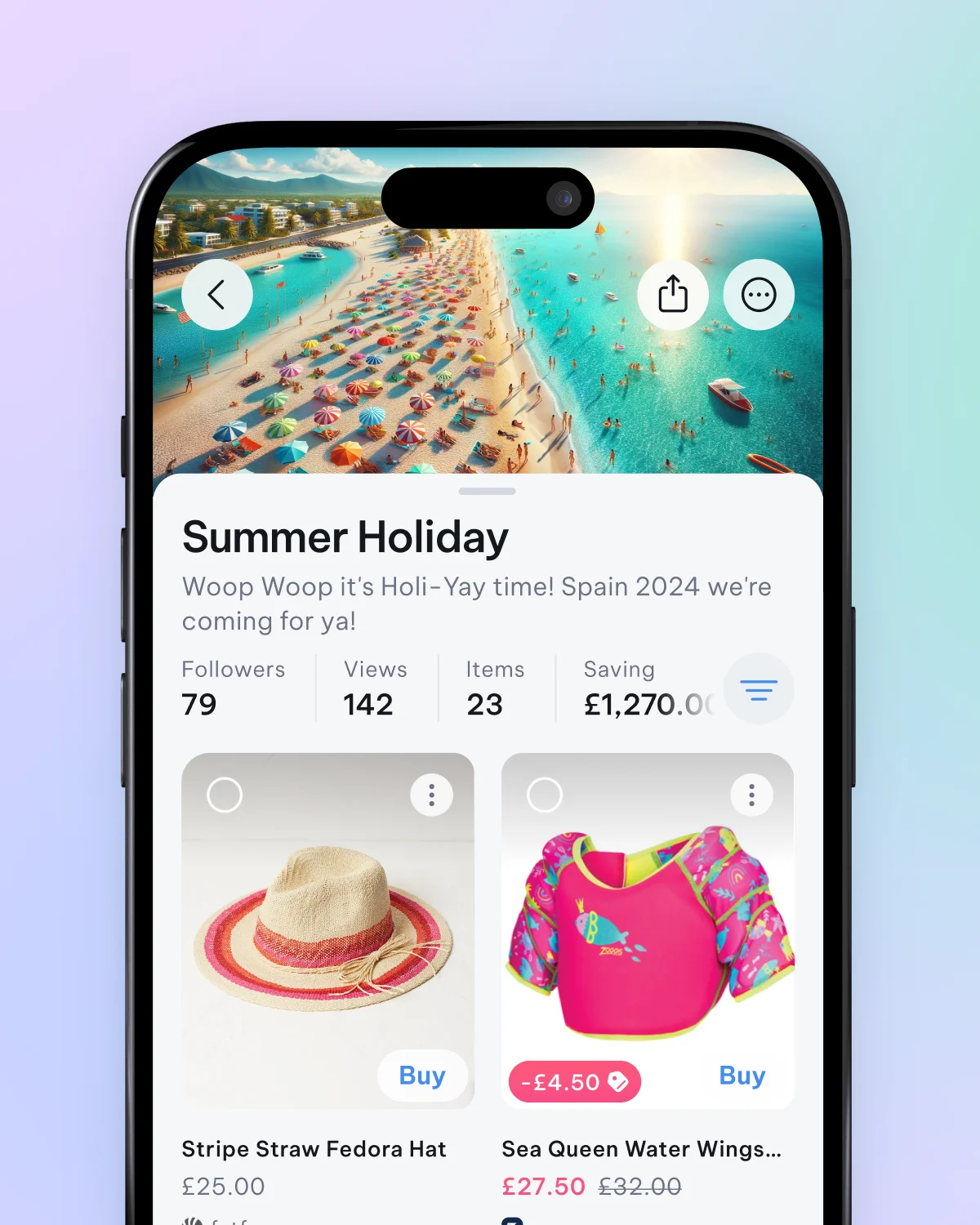
List View
The list view offers a more compact perspective and is well-suited for viewing more information on the screen. You can also tap and hold on the item cards here to bring up more options, such as multi-select, mark as purchased, and share options. The list view is particularly efficient when working through and organising many items.
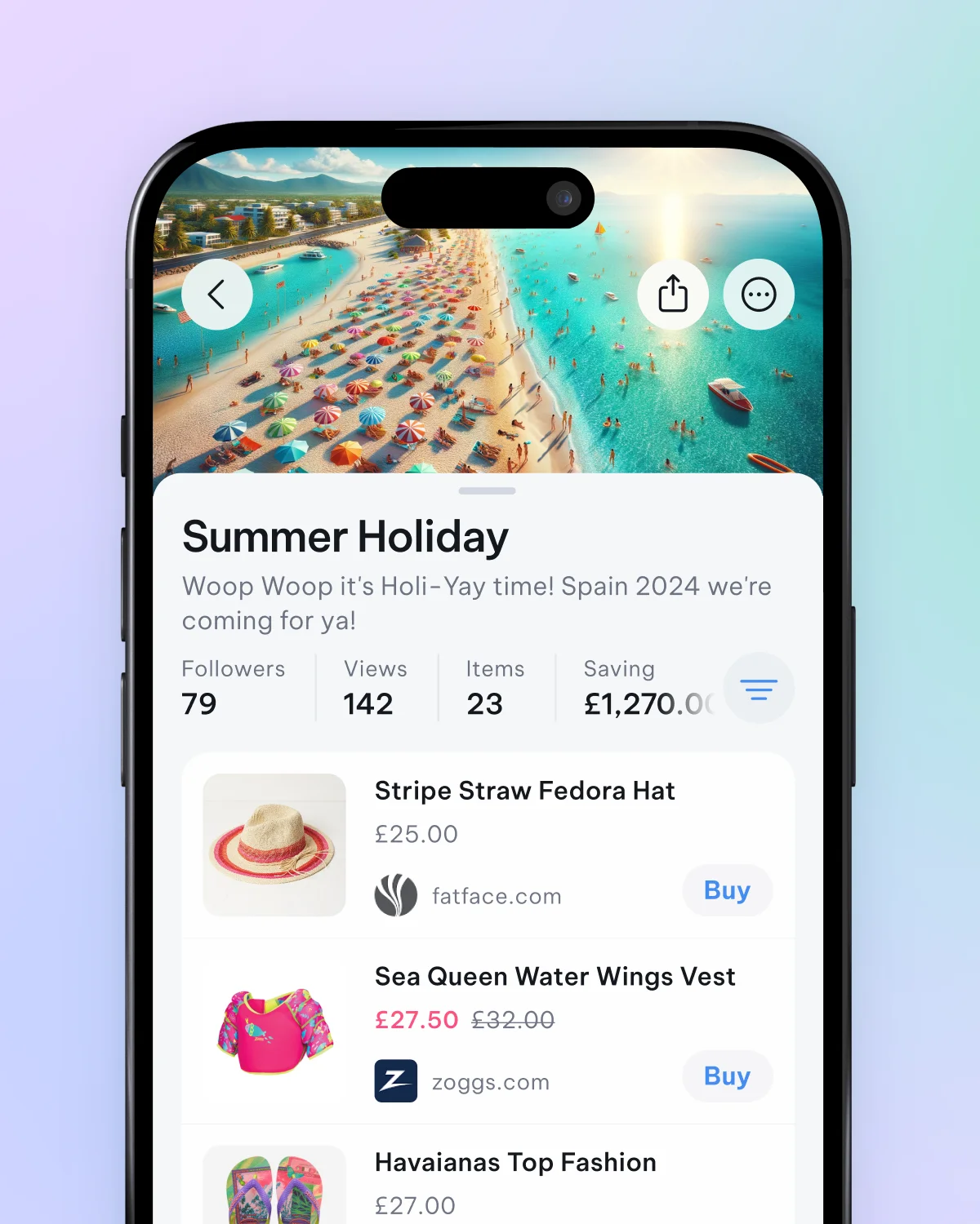
Swipe left and right
In the list view, you can swipe to the right to move an item into another basket or swipe to the left to delete it. Swipe actions are excellent shortcuts for quick item interactions such as moving, sharing, and deleting.
